Showing posts with label Fashion. Show all posts

Wednesday, March 2, 2011

Ashley Granata Portrait

In the late fall months of 2010, around the time I first started working with Nooka, I attended a PSFK conference with Nooka's owner, Matthew Waldman. While I was there, I took some vigorous notes on the future of the fashion industry and it's development in regards to sustainability, Eco-consciousness, and technological and social connectivity.

But for the most part, I drew portraits of the panelists. Here is my favorite, of Ashley Jeanne Granata, who spoke on behalf of the lovely site, Fashism. This lady was absolutely fantastic: vivacious, an amazing speaker, had interesting opinions, and looked amazing.

Wednesday, December 29, 2010

BIG UPDATE

Working for OUT Magazine is a testament to collaboration, and my work with the art department continues. Here are some pieces that were included in the December/January OUT100 issue, which is on shelves now. Go grab a copy, I have 7 illustrations in this issue, and it features a list of the 100 most inspiring voices, advocates and allies of the Queer community to have graced the American cultural scene this past year.


Wednesday, September 29, 2010

Fashion Month Sketches

We are reaching the end of fashion month! The Paris shows have just begun while the Milan, London, and New York shows are now glimmering memories (soon to be gracing the wardrobes of the luxurious and changing the style trends of the everybody). I've been doing some sketches, just to mill through the plethora of FASHION with an eye for personal taste. I'd love to share a few with you.


The Prada show was a breath of fresh air, after all of the taxing, painfully and obviously trend-conscious collections that were being released. We get it. Fashion is about absolutes and buzz-words (just like American politics?), and after looking at A LOT of collections from this season, I get it too. Things come up like "30's to 70's time continuum", "minimal 90's", "80's volume", "60's inspired prints", "traditional Japanese influence", "hippie-chic", floral and the obvious color trends -- blue and orange, and a HELL of a lot of white.

I like how the Prada collection brought to mind Calvin Klein's previous fall collection, with the rounded shoulders and funnel sleeves. In contrast, the nipped waist and contour-following was delightful, and the entire collection was reminiscent of a day at a beach in 1960's Italy (film connotations included).


A detail from Calvin Klein Collection's show. You know how much I love minimalism. And this collection was just as beautiful as the last one, if not a little bit more current and not so futuristic. The straight up and down dress can be a bit boring, but these dresses were beautifully constructed and accented with just the perfect details to keep them interesting.


A look from Jil Sander's collection. First of all, you should probably check this collection out -- but apparently it's not easy for many people to appreciate it. I wasn't one of those people though, and I looked past the unpopular details ("It's so lumpy!!!) and saw this collection as a designer playing with volume, while restraining from making unwearable clothing.

Also, the collection was presented with a Busta Rhymes' song "Gimme Some Mo" as the soundtrack.

This wins points with me.


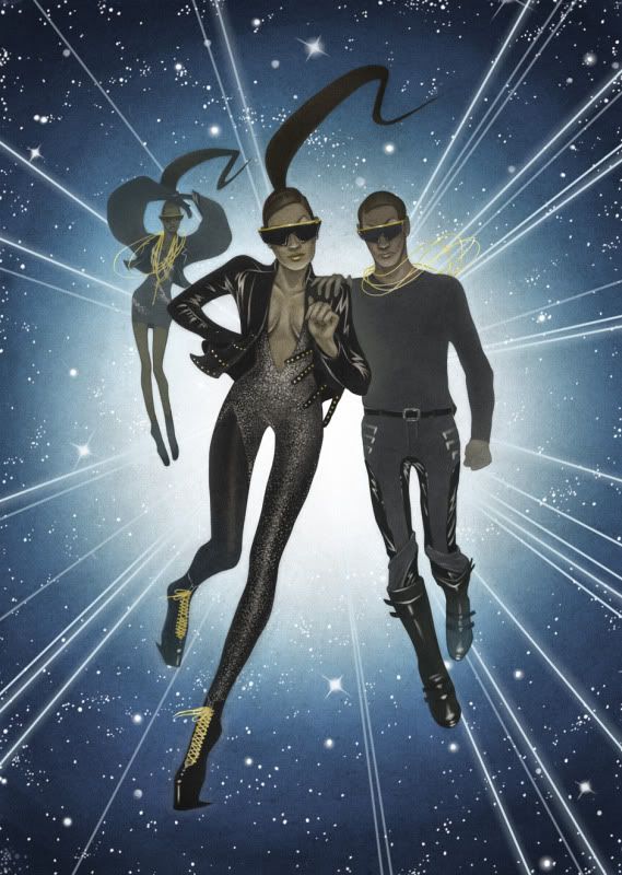
The Versace collection was pretty great, it incorporated Central American and Greek design motifs pretty seamlessly -- and it was entirely wearable. However, I could NOT get over these shoes! Look at how much fun they are!

More sketches to come, so stay tuned.

Sunday, September 12, 2010

Raf Simons Runway Study


This is a look from Raf Simons spring and summer 2010 menswear collection, modeled by none other than Arthur Daniyarov. I love how Raf plays with masculinity and it's identifiers with this look: a men's work suit with highly exaggerated shoulders, pushed up sleeves with what appears to be a striped button up rolled up and over the jacket cuff, and placed beneath a sweater vest -- all neatly tucked into the classic straight leg trouser and leather dress shoes.

"I have access to masculine power and privilege."

It's what you're really saying when you wear a suit, whether you know it or not. Raf just included a dash of football player to make it more obvious.

How does it look in color? Your thoughts?

Saturday, September 11, 2010

Julia Nobis Portrait


This is a portrait of the rising star model, Julia Nobis. Julia has walked quite recently for the likes of Calvin Klein, Chloé, Prada and other heavy hitters within the fashion industry. I think she's absolutely gorgeous, almost a vision of Botticelli's Venus, no?


Monday, September 6, 2010

Sneak Peak!!!


Oh my goodness!

I'm starting a SERIES. I'm doing model portraits! And not just any portrait of just any model. I'm doing portraits of models dubbed "rising stars"!!! So like, the beautiful new kids who get a lot of work for being sublime. My first portrait was of Arthur Daniyarov, and my next portrait is of Julia Nobis! She's BEAUTIFUL. Like, I'm almost positive that she's my muse.

This is just the beginning!

Saturday, August 28, 2010

Daily Number Seven


I'm back a tad early! I think I'm going to try and update regularly starting on Monday. But for today, I'm posting something that was started this past week and only finished today.

This look is from Givenchy's spring 2009 haute couture collection. In reality, this satin sheath dress with partial wrap and cape is the loveliest shade of pastel turquoise.

Tuesday, August 24, 2010

Daily Number Six: Process

This is a portrait of Arthur Daniyarov, a rising star in the male modeling world.. He has been favored recently by the likes of Raf Simons for Raf Simons and Jil Sander, Dries Van Noten, and many other menswear designers of note. He's quite gorgeous, and I think he makes the perfect beauty study. This piece was fun, even if it took a while to get to you. In the past few days I've been busy with other illustrations and career-oriented tasks and busy work. Not to mention that I've been fitting a healthy amount of social life in there too!

I've never really quite posted evidence of my process, and because this was a study, there wasn't too much preliminary work to be shown. I hope it's informative!


This was the preliminary sketch for the finished ink painting. I drew directly on 140 lb cold press watercolor paper, neatly sealed to the table with watercolor tape. I usually treat the hair with inks swiftly and less deliberately than the portrait, so the features are pretty finite and ready for deeper tones, whereas the hair is more or less contour and some directional lines.


This is the under-painting. From the preliminary, I added some darker tone and a fullness to the form with washes of varying shades. The water-thinned ink adds a rich, suppleness that the graphite can't compensate for, which is one of the reasons I may be moving away from graphite.


For the final, I added the darkest tones with pure sumi ink, without added water. I usually keep a few round brushes loaded with water on hand, so I can easily incorporate such deep tones. It can be terrifying, making such a finite decision, but that deep black adds a contrast that you just can't get with any other medium. And it reproduces SO well.

For very fine detail work, I finish with very minute pen work on top, as well as white designer's gouache to clean up and bring out the lightest highlights. I like this gouache because it scan's REALLY well, especially when you make sure to soften the edges of your stroke with water.

Sunday, August 22, 2010

Daily Number Five


I'm a day behind in general now. That's one red slip. One demerit. 10 points from Gryffindor. I am ashamed. However, I will make it up by providing a double dose one day. One day.

This is a look from Givenchy's Spring 2009 collection. BLAST FROM THE PAST. Going way back now, to the days of satin jumpsuit's with tapered legs. And a golden bow. Doesn't Mariacarla Boscono just rock this? She's fantastic, I'm really in love with her. And if you don't already know about my love for Givenchy's creative director, Riccardo Tisci -- well, don't get me started.

Saturday, August 21, 2010

Daily Number Four


I know, I'm a day late. I was ALMOST finished last night, but decided that for my sanity I needed to go and relax with a friend. Busy times, these are.

This one is A BOY. Yeah, boys are hard to draw, but I think I like this one. This look is from Dries Van Noten's fall 2010 menswear line. The collection holds some timely updates to classic looks and was reliably styled for the presentation. I love the layering of the gray scoop neck sweater with the similar navy sweater underneath.

Thursday, August 19, 2010

Daily Number Three


Study after Calvin Klein Collection's fall 2010 collection. I love Francisco Costa's critically named "minimalist" approach to design. For me, it's his ability to play with natural contours, shapes and proportions through garment construction that's exciting. Check 'em out in person, they really are beautiful.

Wednesday, August 18, 2010

Daily Fashion Illustrations


Alright, I've decided to do a fashion illustration a day. Neat and arduous goal, yes? Each little darling takes between one and two hours, and I love doing them -- so why not start a fun and helpful exercise? Also, it helps me hone in on an approach I'm quickly falling in love with. This study is from Erin Fetherston's fall 2010 collection.

Tuesday, August 17, 2010

Another Lanvin Study


If I love it so much, why shouldn't I just...keep studying it?
I like this one, it's a dainty little number from Lanvin's fall 2010 collection.

Saturday, August 14, 2010

Finally


I've been in a creative rut. Maybe it was eight years of striving for lofty artistic and creative goals, maybe it's been my childhood imagination slowly slipping away while the real world settles in -- I don't know yet. I'm trying to find out what's missing from my creative scheme. I think the answer has been hiding underneath my own nose. It's in my sketchbooks, it's in my external hard drive, it's on the interwebz.

When did I stop painting and drawing things that I loved without thinking about who would see them? Just creating for the sake of it, letting your brain vomit on a page.

I did that today for the first time in a very long time as a quick study (instead of inside of my sketchbook), and I'm kind of relieved. I might just do this every day.

The look is from Lanvin's fall 2010 collection. The hair is a bit wack. Also, shush, I know I'm obsessed with Lanvin, don't judge me.

Wednesday, May 19, 2010

Rodarte Diptych


Post-graduation Michael reporting, with the final for my Rodarte diptych. These images include select outfits from Rodarte's fall 2010 collection, a beautiful suite of looks inspired by the sleepwalking maquiladora workers of Northern Mexico and the cruel fates that they've met in the recent past. These pieces are both an homage to the collection and a memorial to the victims who were payed respect by it.

Thursday, March 4, 2010

Nina Ricci and Versace Final


I finally finished this one! I've been really reeling in the problems with long term pieces, and I'm ready to shake that habit. Faster and more expressive work is approaching the horizon, and I feel ready for the change. But I hope you enjoy this little fashion/lifestyle piece about fashion-forward aliens with a vendetta against the démodé ones.

Wednesday, January 27, 2010

Elie Saab


This week has been a lot of fun, working so hard really begins to pay off, especially when you have fun and remain conscious of what the task at hand is. This a piece with a proposed promotional use for Elie Saab's fall 2009 ready-to-wear collection.

Tuesday, January 26, 2010

Gareth Pugh: Part 2


Here is part two of my series using Gareth Pugh's spring summer 2010 collection. I'm diggin' this direction, I hope you like it!

Wednesday, January 20, 2010

Gareth Pugh: Part 1


Here is the first piece of my new two piece fashion campaign! The image has a projected marketing/promotional use for Gareth Pugh's 2010 spring summer collection. I wanted to see how I translated his collection into an illustration, as an image of practical use (specifically for a showroom wall). I took specific looks from the collection and set them into a narrative, hoping to exemplify the look and feel of Pugh's collection. I like it, even if there might be further edits in the future.

Check out the collection at Style.com!

Tuesday, January 12, 2010

Gilt Groupe Illo

Here's another one for Gilt [MAN]ual. This accompanied a blog about appropriate sleeve length and shirt cuff visibility. I like this new streamlined and clean approach to the illustrations for their blog, and the image design is akin to their site's design aesthetic. Go graphite!