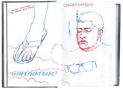
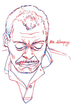
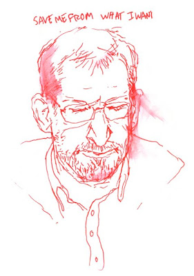
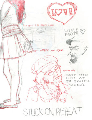
P.S. New York is amazing! My internship with Out Magazine is absolutely invaluable, and the hands on experience with design is nothing but appreciated. Not to mention that I'm learning a lot about the publication development and meeting/getting to know wonderful people all the while.


2 comments:
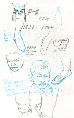
I think you should change your header image to the "MH" in the top of your sketchbook page, right now it the "M" looks like an N, I, and an A
I like your new header. It does look more like an N, but I'm ok with that.
The sketches look good. I like that you used red and blue- like anaglyphs.
Post a Comment